
Portfolio website
1.5 months

Features
My portfolio webiste - the one you're looking at right now! This was by far the most fun and easy-flowing project I've done. Starting from the beautiful and responsive Chakra UI components, all the way to the awesome NextJS developer experience.
The goal of this website is simple - I want to introduce myself and my background, I want to get you to explore my past projects and to give you an option to get in touch with me. Hence, the main features are:
- Project exploration
- classic mode (list of articles)
- OS mode (live preview of each project)
- Blog page
- Contact page
Technology stack
Even though I try to keep up and learn about new JavaScript frameworks, my go-to is always React. I like that it's relatively simple, component based and declarative. It has worked for me for many past projects and I don't have a reason to switch. However, for this project, I wanted my pages to be pre-rendered. I wanted to be SEO and Google search friendly. Also, since my portfolio website is also a blog, this was a perfect time to use NextJS and utilize the benefits of SSG (static site generation).
For the component library, I chose Chakra UI because I've heard lots of great things about it and — let's just say I wasn't disappointed. A variety of production-ready, responsive components from Chakra sped up the process of creating my website. I usually avoid using templates and I like to create things from scratch, but Chakra showed me that maybe I'm not that good of a designer and maybe I should leave it to the professionals.
The final tech stack:
- NextJS
- Typescript
- Chakra UI
Most notable bits
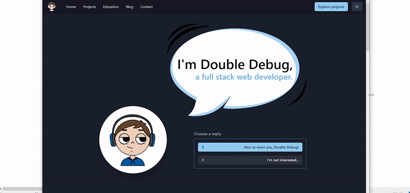
The first thing you see when you visit the website is the dialogue component. You can have a conversation with me, a.k.a Double Debug, you can get to know who I am and what you can do on this page. This is supposed to be the main CTA (call to action) component that keeps the page visitor engaged and hopefully makes him want to interact with the dialogue and explore the page.
There were some reasons not to include this component, especially on the front page of my website, such as lack of accesibility and responsiveness, but I decided to go through with it because I wanted the landing page to be interactive and fun. The dialogue component is, however, only visible on desktop screens. As you can see in the preview below, the landing page transforms into a standard CTA component as the screen gets smaller.
The second most notable bit is, of course, the fake operating system. I wanted to create a playground where you can see live demos of my projects and check them out for yourself, without having to leave the portfolio website. So, what is a better playground then an OS?
It has lots of mockup icons and buttons from real operating systems, such as "My PC", "My documents", "Recycle bin", "Volume control" and so on. These don't work (this is on purpose) and their only purpose is to fulfil the look of a real operating system.
The last part of this app I'd like to highlight is the GitHub contributions component. This is another classic example of my overengineering taking place.
I wanted to showcase a day-to-day timeline of my activity when it comes to coding, and what's a better way to do that then to show my GitHub contributions section? Now, of course I'm not going to post a simple screenshot of my GitHub page and update it every now and then. That would be too simple and the data wouldn't be live & accurate. Instead, I used the GitHub GraphQL API to fetch the data and then display it in a grid of blocks. Since the request to the API needed to be made on every page load, this gave me a reason to use SSR (server side rendering).
NOTE: This is the only page on this website with server side rendering.
The GitHub activity section is shown on my "Contact" page and it doesn't make sense for it to be SSR-ed, however, I made a compromise and turned on the cache for this page. This made it so that it's revalidated once a day and it doesn't make too many requests to the API.
Also, it was lots of fun trying to copy the user interface for this section from GitHub. I'm really happy with how it turned out!
