Minesweeper
1.5 months

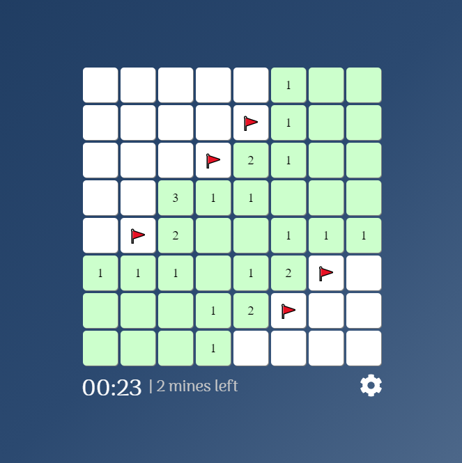
Minesweeper single page game using vanilla JavaScript and awesome animations.
Features
- 3 difficulties
- Customizable grid dimensions
- Responsive design
- Written is plain HTML, CSS and JavaScript
- No 3rd party frameworks
Rules
- Click on a block to open it.
- The first block you open will NEVER be a mine.
- The block can either:
- Be empty,
- Be empty, but have blocks around it with mines,
- Have a mine.
- Clicking on an empty block opens it and opens all surrounding blocks.
- Clicking on a block that doesn't have a mine displays a number of mines in surrounding blocks.
- Clicking a block with a mine means GAME OVER.
- Right-click a block to mark it if you believe that it has a mine.
- When you open all empty blocks, YOU WIN.
Customizability
The game is designed dynamically and allows changing certain game parameters. The configuration is stored in a JSON file and can be changed using the game's interface.
- Board width
- Board height
- Number of mines

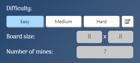
There are 3 sets of difficulties available - easy, medium and hard. Switching between them changes the size of the board (width & height) and the number of mines. You can also customize your own difficulty and change these values, however there are limits. For example, you can't set the height of the board to 100 because that would fill up the whole screen.
| Difficulty | Parameters | Image |
|---|---|---|
| easy | - width: 8 - height: 8 - number of mines: 7 |  |
| medium | - width: 12 - height: 12 - number of mines: 25 |  |
| hard | - width: 20 - height: 12 - number of mines: 50 |  |
| custom | - width: [5-30] - height: [5-12] - number of mines: [2-(width * height / 2) - 1] |  |
Game design
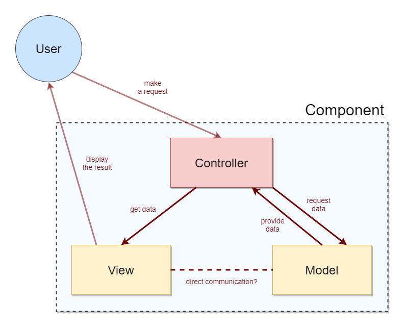
The game follows the MVC (model-view-controller) structure model. Every component has a:
- model
- game logic
- view
- game interface (DOM elements)
- controller
- utilizes both the model and the view on a higher level and enables communication between them

Dependencies
I tried to keep the project as independent as possible. Most of the dependencies are there for the sake of aesthetics.
- FontAwesome
- for various icons/svgs
- Fireworks-JS
- for celebration when you win the game!
- Webpack & webpack-cli
- for module bundling
Interesting edge cases
The maximum number of mines on a board is determined in a very specific way, (width * height / 2) - 1, and it's for a reason.
The first rule of the game says that the first block you open will never have a mine. But under the hood, the game logic is designed so that the blocks around the first block will ALSO never have mines. So while testing different values for the board width, height and number of mines, I ran into a scenario where the number of mines would be 20 and a 5x5 board. This seems OK at first, but when you open a block in the center, it sets that block and 8 surrounding ones to be non-mines. This means that there are 25 - 9 = 16 blocks left. But you set the number of mines to 20. This would break the game and put it into an infinite loop of trying to place a mine.
Edge values for difficulty levels also differ depending on the device used to play the game (mobile, tablets, laptops and desktops). For example, the maximum board width is lower on mobile devices compared to desktop PCs, simply because the screen is smaller. This is all for the purpose of aesthetics and was achieved by using a mix of responsive and adaptive design.
